Data Views
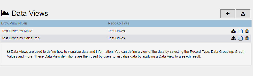
DocMgt offers a unique way to help users visualize their data using charts and graphs. Reporting users can create visualization templates called Data Views and give other users rights to those Data Views. When a user has performed a search they can choose to visualize that search by choosing from one of the predefined Data Views.
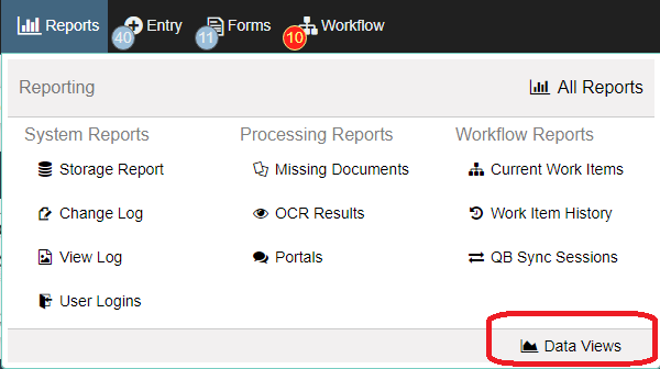
Access the Data Views definition section using the Data Views option under the Reporting panel.
To add a new Add-In, click the ADD button  to bring up the Add/Edit screen.
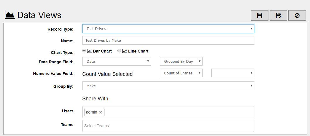
Record Type - Select the Record Type on which this visualization will work. Since each Data View is very particular, you may want several per Record Type.
Name - The name that will be shown to the users so make this setting descriptive but no more than 40 characters to keep it easy to read.
Chart Type - The charts can be either Bar Charts or Line Charts. Each has their own benefit so test each one to see which to use for any given Data View.
Date Range Field - Each Data View will key off a date range for its graphs. Pick the field here that will become the bottom graph axis (x-axis). If you set this to "Point In Time" then all the data will be treated as a single date range and the Group By field will become the x-axis.
Grouped By Setting- You can group the data so each date entry on the bottom of the graph is a day, week, month or year.
Numeric Value Field - Each Data View will key off a number field for its graphs. Pick the field here that will become the side graph axis (y-axis). This is not available if "Count of Entries" is selected in the Operation entry.
Operation - You can have the system perform a mathematical operation on the values in the selected field for each date range. You can have the system merely count the records, add them (sum), find the min, max, average or median.
Formatting - The resulting values can be formatted in one of several ways. Select the proper formatting here. If the formatting you desire is not available it is best to leave it set to the "No Formatting" setting.
Group By - This is optional unless "Point In Time" is selected for Date Range Field. If you choose to group the report by a specific field then each date on the graph will have a value for each separate value found in the specified field. If you Date Range Field to "Point In Time" then this Group By field will become the x-axis.
Share With - The Users and Teams settings allow you to specify the users to share the Data View with. You can specify the users individually, by teams or a combination of both. Remember, in order for you to use the Data View you must be included in the "Share With" setting as well.
More Information - Using Data Views.