Notifications
Notifications are alerts that are shown to the users when they log into the system. You can add notifications for down times, new features and other similar things. They are also used in the cloud for system-wide notifications.
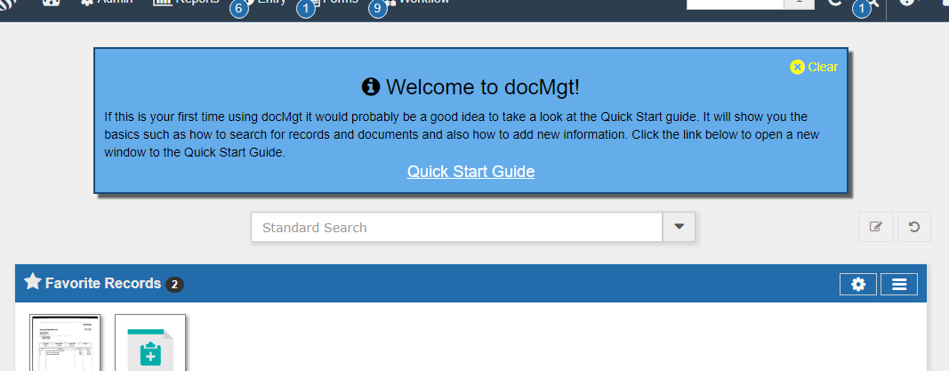
End uses will see the notifications at the top of every page as shown below. They can click the X on the top right to close the notification. If there is another to show them it will automatically appear else the box will go away.
To administer Notifications:
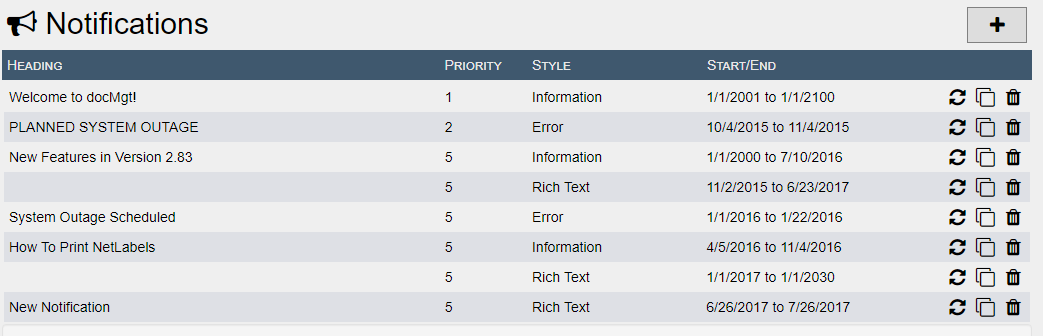
Click on an existing Notification or click Add Notification to edit it.
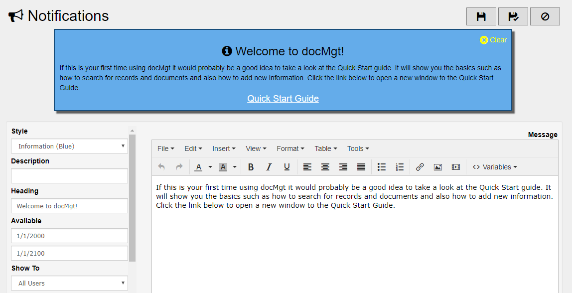
[Preview]- The preview of how the notification will be shown to users. This is how it will look when users go to the Home screen. As you type into the pertinent fields, this preview automatically updates how the notification will appear to the users.
Style - The type of notification to show. Options are:
- Information - Information notifications are blue and are meant to display general information such as welcome messages, new features, etc.
- Success - Success notifications are green and are meant to display information that is highly positive such as meeting business goals, birth announcements. etc.
- Warning - Warning notifications are red and are meant to display warnings and errors such as server maintenance schedules, system failures, etc.
- Blank / Rich Text - This type shows a white background without an icon.
Heading - The heading will be shown on the top of the notification like a headline.
Available - The dates between which this message should be shown to users. If the users closes the notification before this date then this date is ignored for that user.
Show To - Choose the users to which to show this notification.
Priority - The Notifications will show up one at a time. When the user clears a notification then the next one is shown. The order in which they are shown is by Priority. The lower priority number items are shown first.If there is more than one with the same priority then the one with the earlier Start Showing date is first. If that is also the same then the one that was entered into the system first will be first.
Max Height - Notifications can get very large so this allows you to set a maximum height for the notification panel. If the contents are larger than the max then the panel scrolls internally.
Link Text - The text to use for a link (if any). If used this will be the text to show the user for them to click on.
Link URL - The URL to take the user to when clicked. This will open in a new windows or new tab depending on the configuration of the user's browser.