Panels and Buttons
Use this to customize the look of the panel headings and the main buttons in the system. This panel is divided into 3 sections - Headers, Sub-Headers, and Buttons.
Headers
This allows you to set the colors of all the main panel headers in the system. These are usually set to complement the toolbar colors and sometimes are the same colors.
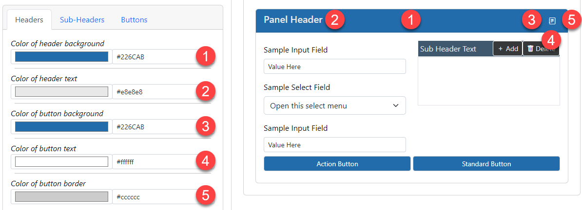
- The background color of the headers. This color will show behind the text titles of the panels. Make sure this has a nice contrast with the text color property.
- The text color of the headers. Make sure this has a nice contrast with the background color property.
- The background color of the header buttons. This color will show behind the text of the buttons. Make sure this has a nice contrast with the text color property.
- The text color of the header buttons. Make sure this has a nice contrast with the background color property.
- The color of the border for the header buttons. This color will show around the edges of the buttons. This is sometimes set to the same color as the text color.
Sub-Headers
This allows you to set the colors of all the inner panel headers in the system. These are usually set to stand out from the main headers.
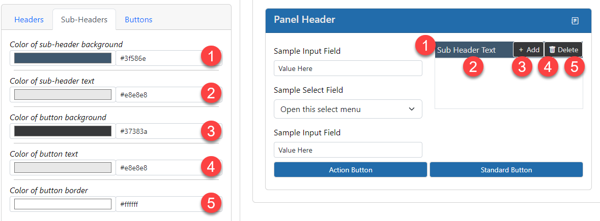
- The background color of the headers. This color will show behind the text titles of the panels. Make sure this has a nice contrast with the text color property.
- The text color of the headers. Make sure this has a nice contrast with the background color property.
- The background color of the header buttons. This color will show behind the text of the buttons. Make sure this has a nice contrast with the text color property.
- The text color of the header buttons. Make sure this has a nice contrast with the background color property.
- The color of the border for the header buttons. This color will show around the edges of the buttons. This is sometimes set to the same color as the text color.
Buttons
This allows you to set the colors of the buttons in the system. There are 2 types of buttons - stanadard and action. Standard buttons are the most common and represent normal functionality in the system. Action buttons are used for when there is a special action such as a Delete or a Save action. You can use colors to show differences between those button types or set them the same so they don't stand out.
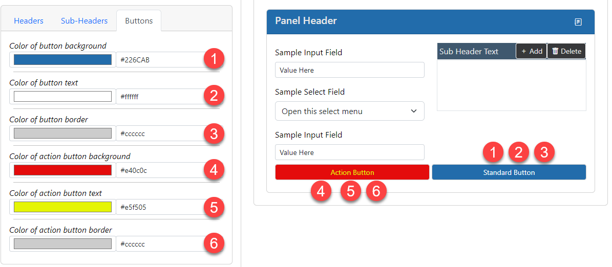
- The background color of the standard buttons. This color will show behind the text of the buttons. Make sure this has a nice contrast with the text color property.
- The text color of the standard buttons. Make sure this has a nice contrast with the background color property.
- The color of the border for the standard buttons. This color will show around the edges of the buttons. This is sometimes set to the same color as the text color.
- The background color of the action buttons. This color will show behind the text of the buttons. Make sure this has a nice contrast with the text color property.
- The text color of the action buttons. Make sure this has a nice contrast with the background color property.
- The color of the border for the action buttons. This color will show around the edges of the buttons. This is sometimes set to the same color as the text color.