Toolbar
You can customize the look and feel of the toolbar screen by changing its logo and colors. The toolbar is divided into 2 sections – upper and lower. The upper section is approximately the top 2/3 where the logo and drop down navigation options are. The lower section is the bottom 2/3 where the “Last ??” buttons and Favorites are.
Upper
This allows you to set the colors of the top section of the toolbar
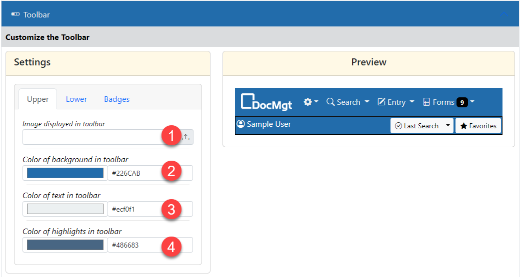
- The image to use for the top-left portion of the toolbar. This is normally the customer’s logo graphic. You can upload an image or use a URL from another public site. It must be publicly available for it to be shown properly. If you leave this setting blank, then the default logo will be shown. Try not to use a very wide graphic or it will push the buttons too far to the right.
- The background color of the upper toolbar. This color will show behind the option buttons. Make sure this has a nice contrast with the text color property.
- The text color of the upper toolbar. Make sure this has a nice contrast with the background color property.
- The highlight color of the toolbar. When an option or section of the site has focus, the highlight color will be shown on that options menu to let the user know where they are. This color should probably be similar to the background color but different enough to show up well.
Lower
This allows you to set the colors of the bottom section of the toolbar
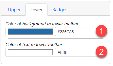
- The background color of the lower toolbar. This color will show behind the option buttons. Make sure this has a nice contrast with the text color property.
- The text color of the lower toolbar. Make sure this has a nice contrast with the background color property.
Badges
This allows you to set the colors of the alert badges in the toolbar.
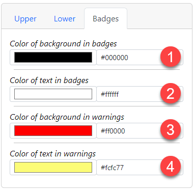
- The background color of the badges in the toolbar. This color will show behind the item counts for E-forms, Workflow, etc. Make sure this has a nice contrast with the text color property.
- The text color of the badges. Make sure this has a nice contrast with the background color property.
- The background color of the warning badges. This setting is for V3 backward compatibility. We do not use this in V4 so you can usually ignore it.
- The text color of the warning badges. This setting is for V3 backward compatibility. We do not use this in V4 so you can usually ignore it.