Input Fields
The Input Fields section contains the fields that are mostly used for input. Simply click then drag the field you want to add to your form.
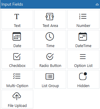
Text - This is a single-line text entry field. This is the most common entry box used.
Text Area - This is a multi-line text entry field. With it you can display and enter more than one line of text per field.
Number - This is a text field that is limited to allow only numbers, commas, decimal places and currency symbols.
Date - This is a text field that only allows date values to be entered. Also it has a calendar that pops up with clicked. NOTE: Date fields do not update the client until they lose focus.
Time - This is a field that only allows time values to be entered. It uses time selectors to walk the user through selecting the proper the time.
DateTime - This is a field that combines the Date and Time in one selection
Checkbox - This is a check box field that allows ON or OFF entry and can optionally show text alongside.
Radio Buttons - This is a field for allowing the user to select one of many options.
Option List - This is a drop-down list that allows the user to select one of many options.
Multi-Option - This is a field which shows a list of available options and allows the user to select one or many of the options. * see MULTI-OPTION TIP below.
Simple List - This is a list that allows the user to select one of many options.
Hidden Field - This is a field that is hidden from the user. It is used to store pre-set data that you don't want the user to see. Hidden fields are, however, shown in the designer.
File Upload - This is a field that allows users to select one or many files to be uploaded along with the form.