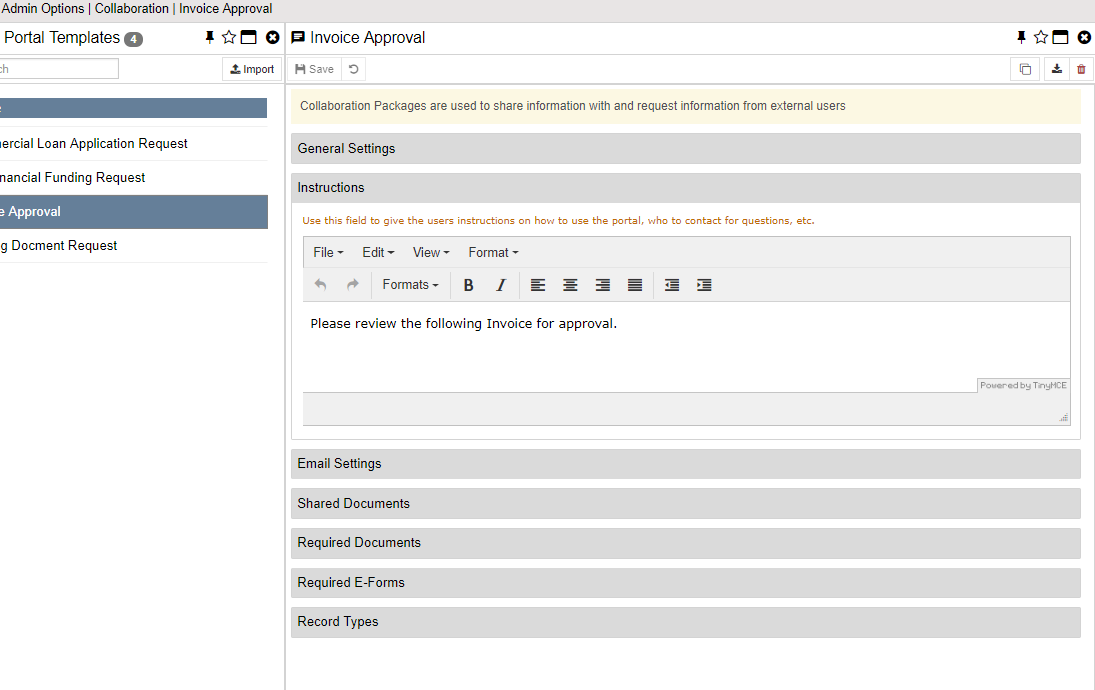
Instructions

The instructions that you wish to show to the external users.
Instruction Header
This shows at the top of the portal and is the main area to give instructions. This should be an explanation of what the expectations are of them when using the package. This is a Rich Text field so you can use colors, fonts, etc. You can also use variables in this section.
Instruction Footer
This shows at the bottom of the portal and is normally used for copyright or other legal disclaimers. You should keep the real instructions in the header area.
Completed Instructions
When a user is done with the portal, you can replace the Instructions Header section with this section. This is useful to change the instructions as to what to do next or to thank them or whatever makes sense after the portal is complete.
Buttons in Instructions
Starting in Version 4.10 we have added the ability to code buttons into your Instructions and Instructions Complete screens. There are only a couple of things the buttons can do at this time but the list of action types may grow in later versions.
The basic syntax to the button code is this:
{BTN(showwhen|title|action|value)}
showwhen - When to show the button. Available options:
0 = Always Show
1 = Show if portal NOT complete
2 = Show if portal IS complete
title - The text to put in the button
action - The action to take when the button is clicked. Available options:
eform = Open an E-form
url = Open a browser tab to a web URL
value - The value that needs to be used for the button to complete it's actions
For eform actions, this is a numeric value:
>0 = the ID of the E-form to open
-1 = open the next form that has not been completed
-2 = open the first form from the e-form list
for url actions, this is the URL to open